The Oil and Equity Relationship in Context

Please note that we are not authorised to provide any investment advice. The content on this page is for information purposes only.
Equities and oil continue to be moving in the same direction. During the first few weeks, they were moving down together and now up together. It is frustrating for asset managers. Large cap and small cap stocks are moving together as if everything is being tarred with the same brush.
We continue to try to tease out the relationship between equities and oil prices, but there is some underbrush needed to be gotten rid of before we can have a clear space to share our tentative conclusion.
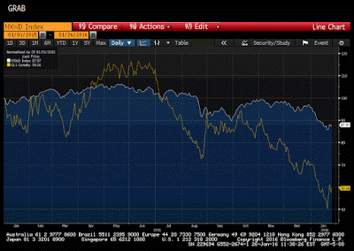
First, we need to break out of the habit of thinking that relationships can be simply eyeballed by looking at a chart. This first Great Graphic is typical of charts some analysts and reporters are showing. The white line shows the MSCI free-float weighted index of world equities (emerging and developed markets). The yellow line is the continuation contract for light sweet crude oil. It appears to be a good fit.
 However, in this form, it is too much of an exercise in curve fitting. There are two time series and two different scales. There is no objective reason to line up the two times series so that 400 on the equity index is almost $45 a barrel for oil, or why 360 on the index is roughly equal to $27.50 on oil. It looks more pleasing to the eye, but this is not a beauty contest.
The second chart here shows both times series index so the movement of each can be seen on the same scale. Both began at 100 on 1 January 2015. MSCI global equity index is off about 12% through today. Oil is off by nearly 41%.
While the first chart makes it appear that an investor in equities and oil would have lost the same amount, the lower chart indicates that this is certainly not the case. Investing is difficult, and the outcome is important. We owe it to ourselves, and others to use as robust of tools as we can and be wary of pretty pictures.
 We wanted to digger deeper and looked at the longer-term relationship. We conducted a regression analysis of the daily percent change in oil and the daily percent change in the world equity index since the start of 2000. Based on a linear regression, we found that the change in oil could explain a little less than a fifth of the change in world equities. This may in fact, overstate the case. Some of those equities, of course, are in the oil sector, like Royal Dutch Shell, ExxonMobil, Pemex and Petrobras, for example. This clearly suggests that while long-term equity investors should monitor oil prices, the relationship should not be exaggerated.
Great Graphic: World Equities and Oil is republished with permission from Marc to Market