Economic Graphs and Charts
Please note that we are not authorised to provide any investment advice. The content on this page is for information purposes only.
Economic graphs are related to economics, which is a branch of social science that is concerned with money flow patterns, trade activities and industrial production in a state. Analyzing and understanding these economic patterns require an in-depth scientific approach. This further involves interpretation of theories that are based on trends and data. No wonder, economists use economic graphs and charts to represent complex data in pictorial format.
Economic graphs are related to economics, which is a branch of social science that is concerned with money flow patterns, trade activities and industrial production in a state. Analyzing and understanding these economic patterns require an in-depth scientific approach. This further involves interpretation of theories that are based on trends and data. No wonder, economists use economic graphs and charts to represent complex data in pictorial format.
Understanding Economic Graphs and Charts
Graphs are basically pictorial formats or diagrams that can be used to represent variations in comparison with that of one or more other variables. In economics, it is used to simplify complex data. Representation of economic models and empirical data through charts is also popularly used by economists.
Types of Economic Graphs and Charts
Economists employ different types of graphs and charts, depending upon the range of data and multiplicity of variables. Some of these are:
Flow chart:
- It uses lines and circles to draw connections between different stages of a process.
- It helps to explain how different components of economics interact under particular market situations.
Production possibilities frontier:
- This graph tends to measure economic output in terms of available factors of production.
- In the fig 1.1, the graph shows four variable points that represents different output conditions. The points ‘A’ and ‘B’ represents optimum use of resources, ‘C’ corresponds to inefficient production and ‘D’ refers to a production stage that is not possible with the current factors of production.
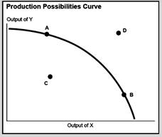
Fig 1.1
Source: http://www.colorado.edu/Economics/courses/econ2020/section1/section1-main.html
Time-series graphs:
- Measure the performance of a variable over a period of time.
- Time is generally denoted over horizontal axis and variable on vertical axis.
- The following example shows growth of the Canadian GDP from 2000 to 2006.
http://www.economywatch.com/images/Economic_Graph2.jpeg
Fig 1.2
http://dept.econ.yorku.ca/~sam/1000/l1/index.html
Scatter diagrams:
- This graph represents the values of a bivariate data as a set of points.
- At times, a combination of variable can be used to interpret their performance against time.
- Fig 1.3 shows a scatter graph which represents data for working-age population as covered by mandatory pension schemes against GDP per capita.
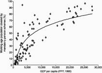
Fig 1.3
http://www.idrc.ca/openebooks/373-7/
Multicurve diagrams:
- This graph shows multiple relationships between the variables.
- It has multiple curves to display the dynamic relationship at different points in time.
- The demand and supply graph is the best example for a multicurve diagram.
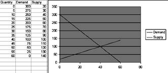
Fig 1.4
http://csob.berry.edu/faculty/economics/ExcelGraphDevelopment/BuildingExcelWorkbooks.html
Besides using graphs to represent data, it can be used to simplify and enhance user-friendly interpretations spanning a particular set of data.