Inequality Stretches Across England
Please note that we are not authorised to provide any investment advice. The content on this page is for information purposes only.
With its long history of feudal oppression, industrial workhouses, and dire slums, England is no stranger to deprivation. Even today, we are all too familiar with phenomena like “beds in sheds,” soaring food bank use and fuel poverty. Therefore, it is hardly surprising that, whenever there is a release of a new deprivation dataset, we tend to focus our attention on the “most deprived” places across England.
With its long history of feudal oppression, industrial workhouses, and dire slums, England is no stranger to deprivation. Even today, we are all too familiar with phenomena like “beds in sheds,” soaring food bank use and fuel poverty. Therefore, it is hardly surprising that, whenever there is a release of a new deprivation dataset, we tend to focus our attention on the “most deprived” places across England.
While these areas warrant urgent attention, there are also many other significant stories to tell. Therefore, when the government released the latest Indices of Deprivation for England, I delved into the data through mapping and analysis to see what I could uncover. However, before I share my findings, it will be helpful to explain deprivation.
Deprivation is a mix of indicators relating to income, jobs, education, health, crime, housing, and environment. It is a broader measure than poverty – which tends to focus on income – but there is significant overlap between the two.
By combining deprivation data from 2010 and 2015 with freely available map data, I produced deprivation maps for all 326 of England’s local authorities – all of which are available for download and re-use on my website. The overall message is clear: not much has changed.
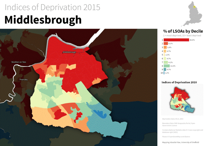
Deprivation in Middlesbrough, 2015. Alasdair Rae
For example, 49% of Middlesbrough’s neighbourhoods remain within the most deprived 10% in England, compared to 47% in 2010. It is a similar story in Hull, where 45% were in England’s most deprived decile in 2015, compared to 43% in 2010.
Unlike poverty, deprivation is a relative measure, which means that we can also locate England’s “least deprived” areas – such as Hart, in Hampshire. Yet the patterns in these areas have also proved to be very persistent: not much has changed at either end of the deprivation spectrum.
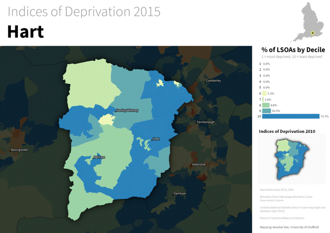
Indices of Deprivation 2015 in Hart, Hampshire (click to enlarge). Alasdair Rae
Of course, this persistence should not surprise us. We are only talking about a five-year period – and even the most optimistic policymaker would not expect much to change in half a decade. In fact, they probably wouldn’t expect to see much change over a whole decade, so entrenched are patterns of deprivation and so humble the impacts of urban policy.
A special case
However, there is one major exception to this rule: London. If we map out the data from the 2004 Indices of Deprivation, and compare them to the most recent results, we see some striking changes.
I looked at areas in London, which were within England’s most deprived decile in both 2004 and 2015 – they appear in red on the maps below. In 2004, London had 462 of England’s 10% most deprived areas. By 2015, this figure had shrunk to 274.
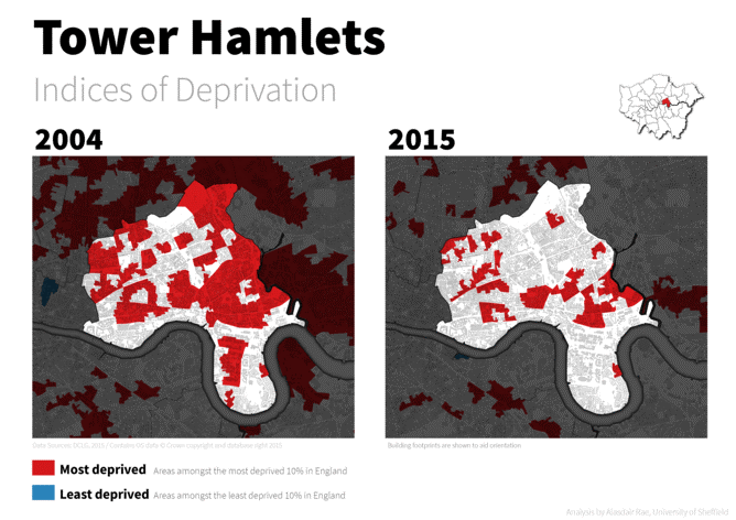
The disappearance of acute deprivation in Tower Hamlets? Alasdair Rae
The disappearance of many of the red areas since 2004 helps document the apparent dispersal of London’s poorest residents over little more than a decade.
These changes are most obvious in areas at the forefront of gentrification struggles, such as Tower Hamlets, Hackney, Newham, and Camden. You can see the results of this analysis for every London Borough here.
Hold on a minute though. Shouldn’t we be applauding the elimination of London’s most deprived areas? If these changes were due to individuals escaping deprivation and poverty, then the answer would be “yes.” However, I do not believe this is the case.
Given the influx of new residents in these areas, it is more likely to be a result of changing local populations, particularly in East London where the process of gentrification is well documented. As recent events like the Cereal Killer Cafe protests have shown, this inevitably results in conflict and resentment at a local level.
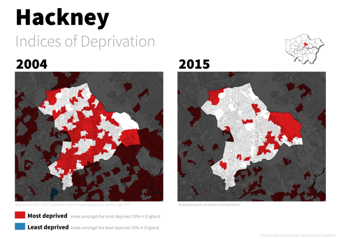
Are Hackney’s poorer residents now better off? Alasdair Rae
At the same time, we are also seeing increases in the number of deprived neighbourhoods in some Outer London Boroughs, such as Bromley. The two phenomena may not be directly related, but I would not rule it out. It could well be that as wealthier residents move into the more central boroughs, poorer Londoners are being pushed toward the city’s more affordable outskirts.
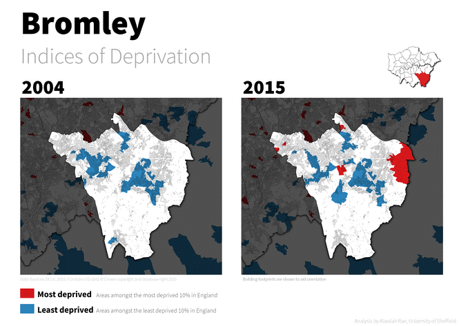
An increase in acute deprivation in Outer London? Alasdair Rae
If we are serious about tackling acute deprivation in our society, then we should shift our focus beyond deprivation and towards inequality itself. Thankfully, the realisation is gradually dawning that addressing inequalities on a national level should be a matter of priority. The OECD has argued that when inequality rises, economic growth falls – and that we should all be more concerned with how those on the bottom 40% of incomes in society fare.
Yet this message has to date had little impact upon government policies around the globe. To address the kinds of inequalities seen in England, there first needs to be a realisation that the impacts of austerity policies tend to be very spatially uneven and often serve to intensify levels of deprivation at the local level. This message is not currently a popular one, but I think it needs urgent attention.
Here’s what we learned from mapping out England’s inequalities is republished with permission from The Conversation