Arguing Against Kocherlakota’s Argument

Please note that we are not authorised to provide any investment advice. The content on this page is for information purposes only.
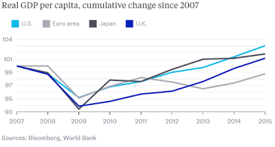
Former Minneapolis Fed President Kocherlakota, and now a professor at the University of Rochester used this Great Graphic in a recent Bloomberg column.
Kocherlakota was a dove when he was at the Fed and remains dovish. He is concerned that the US economic performance is, as he says, not what it seems. By this, he means it is weaker than the GDP figures suggest. He acknowledges the US has grown faster than the other high-income economies. He dismisses it because the US population has also grown faster, but the participation rate has not.
He thinks two things follow from this assessment. First, that if the US economy is not comparatively stronger than it means that the Fed’s asset purchases are not more effective than in other countries. Kocherlakota thinks this means that Fed should be more cautious therefore about unconventional policies and their ability to substitute for conventional monetary tools. He does not specify an actionable course when the zero-bound has been reached.
Second, Kocherlakota argues that there is more that can be done to increase employment for the prime age cohort (25-54 yrs.). He does not offer specifics, but it seems that this is the role of fiscal policy, not monetary policy.
I am not persuaded by Kocherlakota’s arguments. Even if we were to accept as given that US growth has not exceeded Europe or Japan’s by very much, that does not mean that the Fed’s asset purchases were not more effective. Consider the bang for the buck. The Federal Reserve’s balance sheet was roughly 25% of GDP. The BOJ of Japan’s is more than three times larger proportionate to its GDP. If the Fed achieved similar results as the BOJ, which Kocherlakota claims, with considerably less resources, that also speaks to effectiveness.
In addition, the fact that the Fed’s unconventional path began not months or quarters, but years before the BOJ or the ECB’s asset purchases is also meaningful. When the Federal Reserve began its asset purchases, interest rates were much higher. Moreover, Kocherlakota may be mistaking the goal. The Federal Reserve did not call its asset purchases QE, but rather credit easing. It was not offered as a solution to low inflation. Both the ECB and the BOJ are buying assets ostensibly to lift inflation toward its respective targets.
Kocherlakota presents this chart of GDP per capita but then dismisses it because the US outperformance is not as substantial as he wishes. Population grew faster in the US than in the other centers, and so did GDP per capita. There is now roughly a five percentage point gap between the US and Eurozone GDP per capita growth over the eight years captured in the chart. This is significant especially as it comes on top of the pre-existing gap in the US favor.
Japan’s performance is interesting for a different reason. Its GDP per capita fell further than the US during the crisis and recovered quicker. However, its improvement faltered, and the US has been able to overtake Japan in the last two years. Essentially, what is happening in Japan is its economy is shrinking slightly slower than its population is falling.
The UK economy was hit as hard as Japan by the crisis, in terms of GDP per capita, and harder than the Eurozone. It did not experience that double dip that the Eurozone did and since the middle of 2013, GDP per capita growth has surpassed the Eurozone’s. Depending the how much Brexit disrupts the economy in H2, its GDP per capita growth may surpass Japan’s this year.
Kocherlakota’s argument that the US economic recovery is not so impressive is more compelling when looking not at international comparisons, but in the context of post-WWII US recoveries. Nevertheless, it is stronger than expected if one accepts historical work of Reinhart and Rogoff (This Time is Different). Looking at the chart, it is difficult to find support for the other big interpretative framework offered by Summer’s “secular stagnation” claim.
Great Graphic: GDP Per Capita Selected Comparison is republished with permission from Marc to Market


